Lawren: Visual Brand Strategy, Identity, & Album Art Design
Complete Creative Strategy
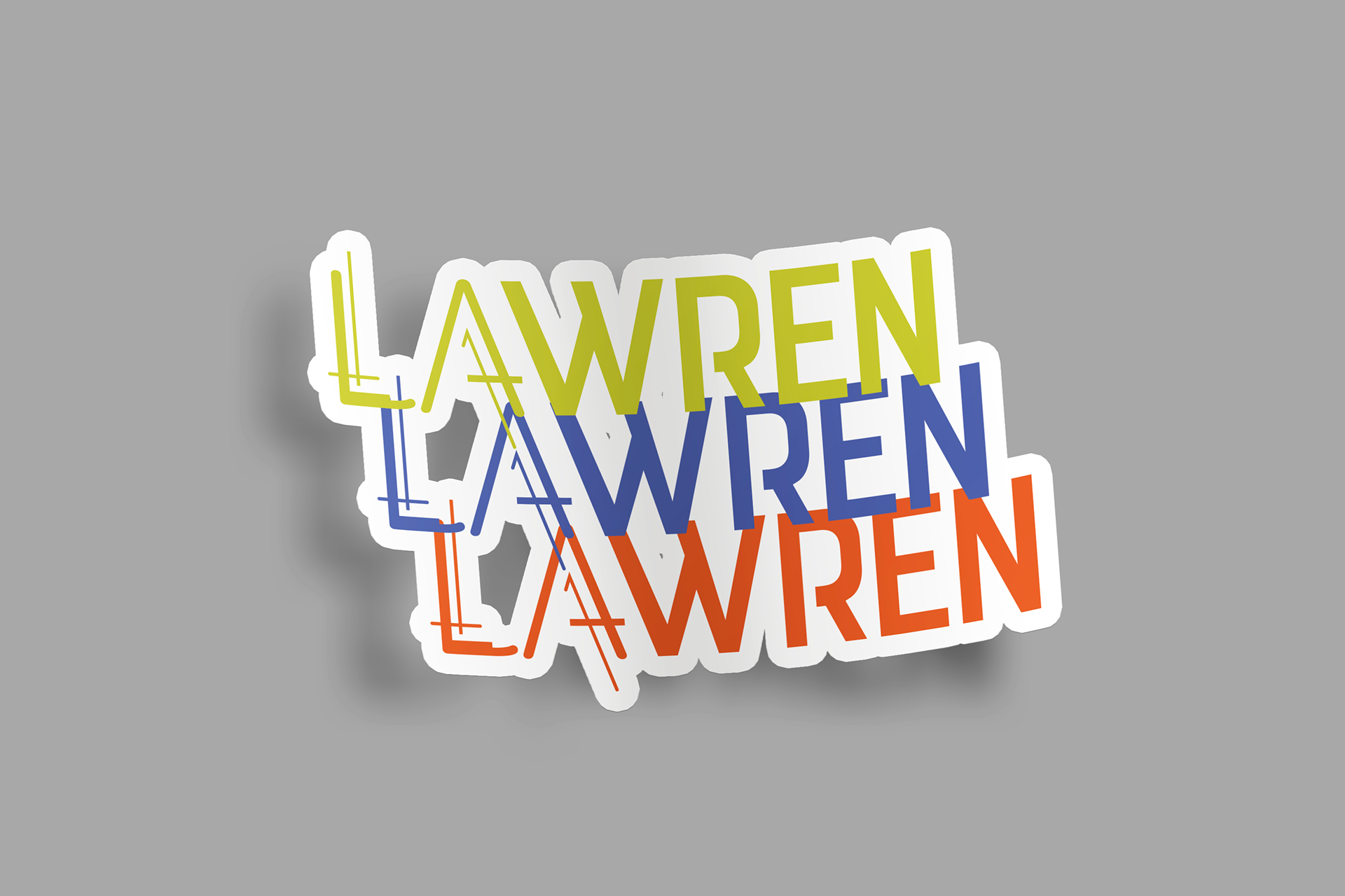
Client: LA WREN
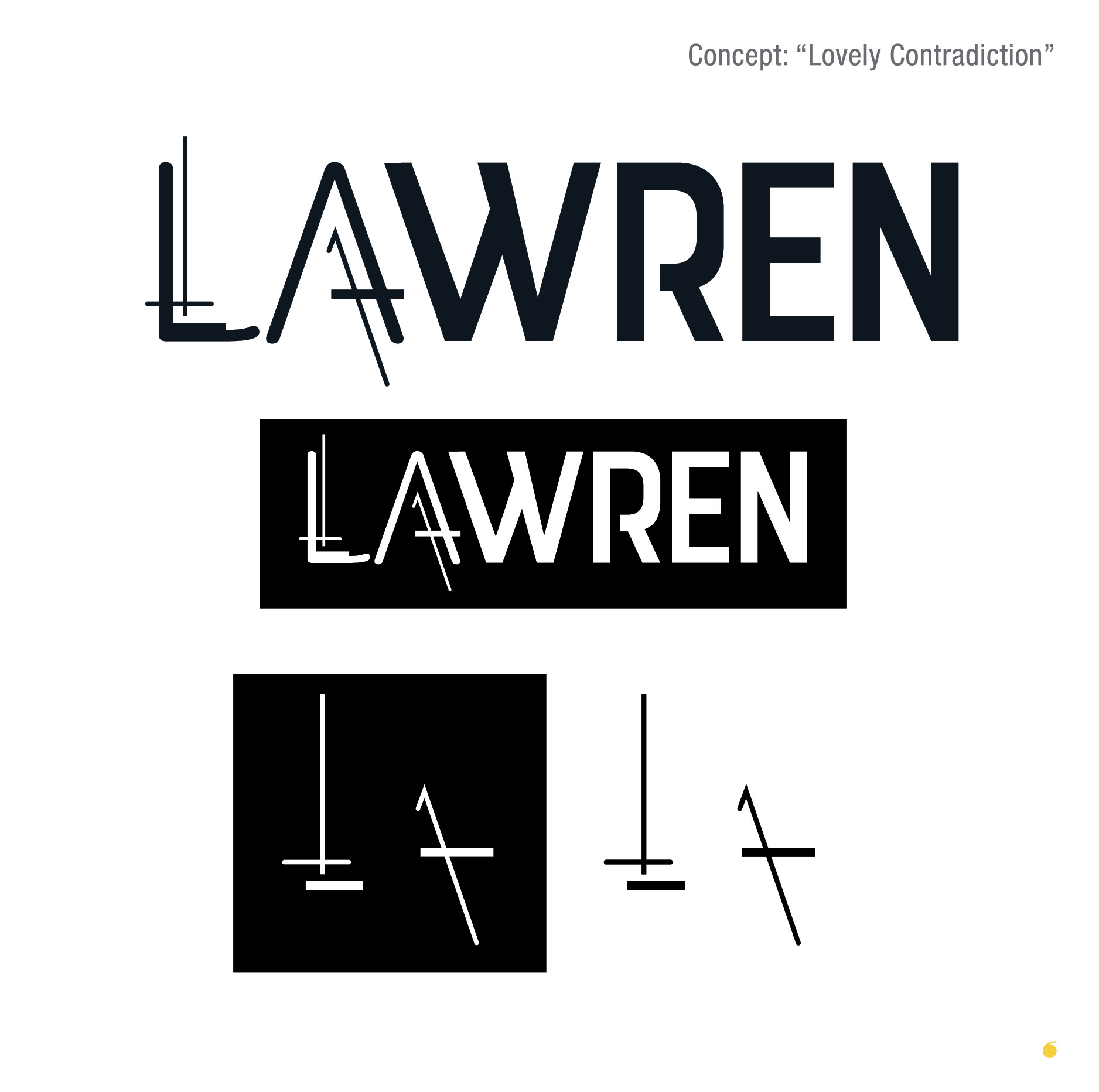
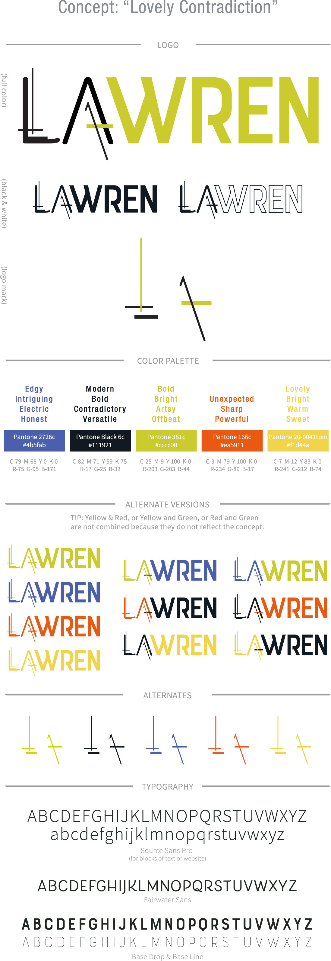
Concept: "Lovely Contradiction"
Concept: "Lovely Contradiction"
My goal was to create a logo with movement that was modern and a bit nostalgic. It balances sharp boldness with a touch of soft-edged feminity. The new logo for LA WREN reflect versatility and strength; the lovely and the contradicting.
THE LINES were created to communicate movement and an offbeat contrast. The lines also represent the connection between the modern and nostalgic that make up what LA WREN music is. Lines symbolize growth and strength and versatility.
THE FONTS chosen were each researched and selected to create a foundation for a type-centric logo. I wanted to communicate the "contradiction" portion of the concept by choosing to use thick and thin typefaces, sharp and round lines, with modern and nostalgic styles. Each of the typefaces are meant to compliment eachother while holding opposite meanings; lovely in the soft and contradictory in the sharpness.
THE COLOR PALETTE was meticulously chosen to bring out the most important elements of your brand, which represents you. The descriptions next to each color encompass the psychology of each color that will be communicated to your audience on an deep instinctual level. Colors are a key element in any logo and can often be a deciding factor and attract your ideal listener.
These colors, elements, and fonts will work together seamlessly to solidify the concept of "Lovely Contradiction" and establish that LA WREN bold, bright, offbeat, modern, intriguing, and unexpected.
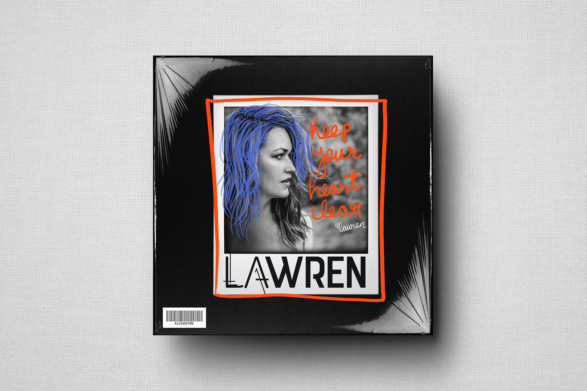
Album Art: Keep Your Heart Clear Single
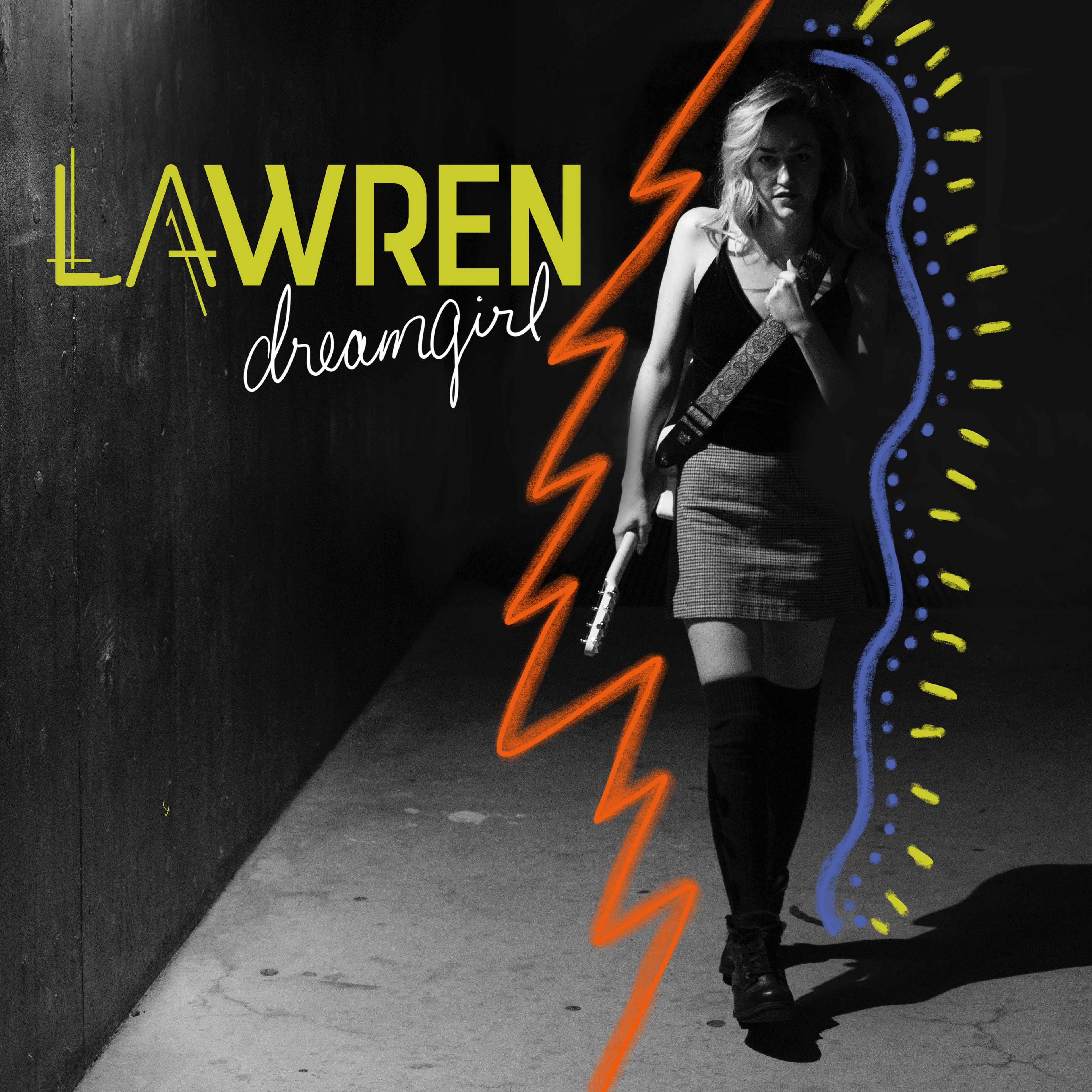
Album Art: Dream Girl Single
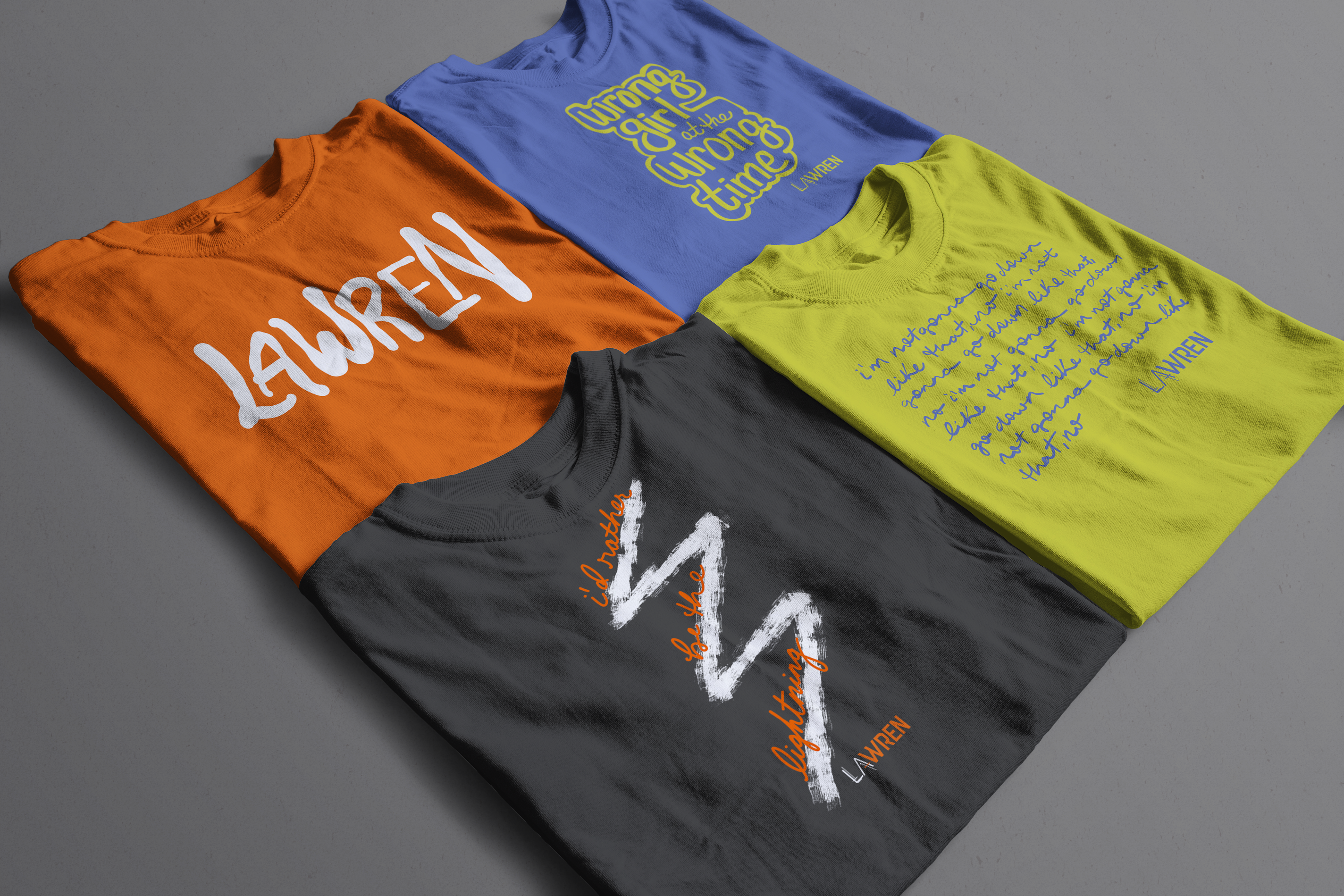
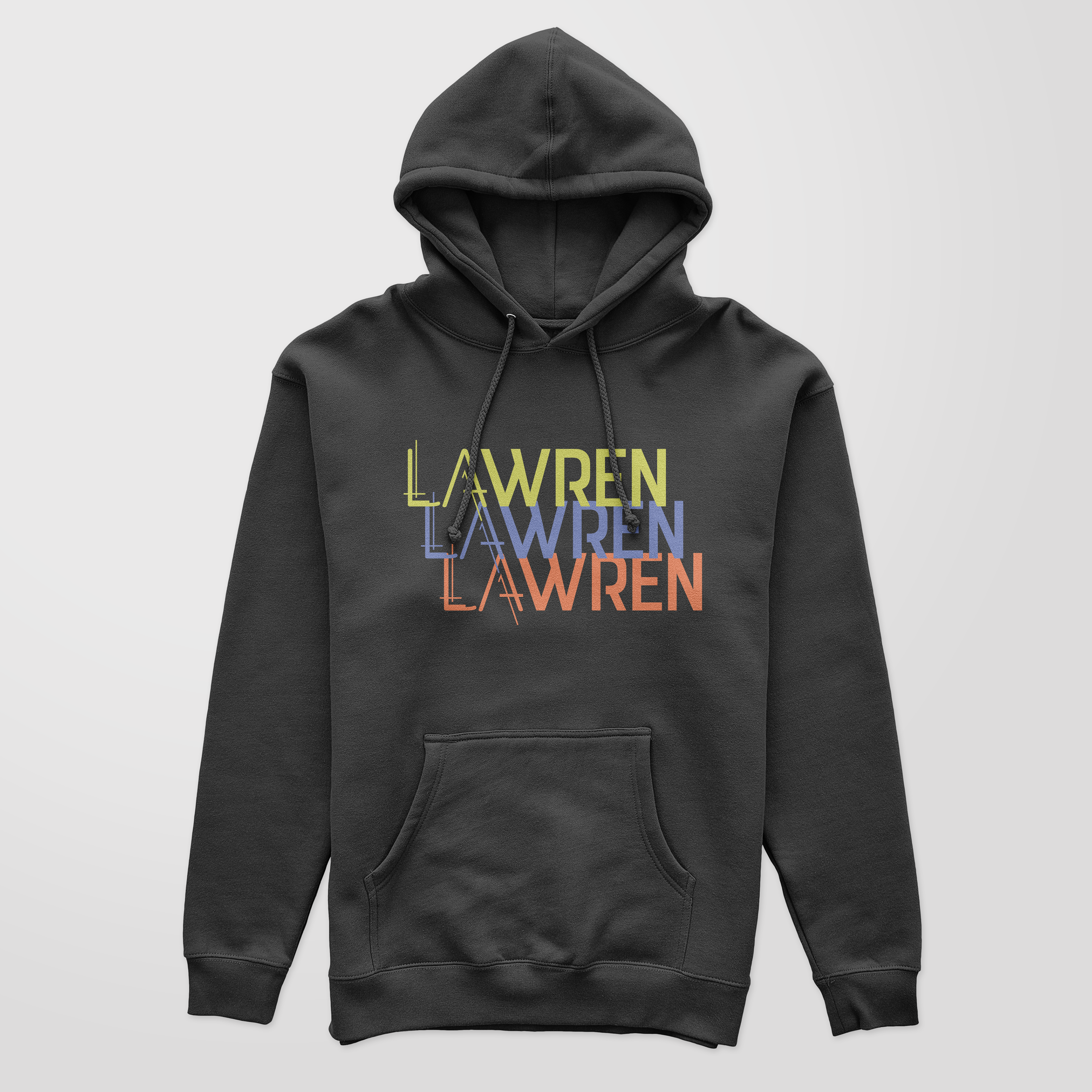
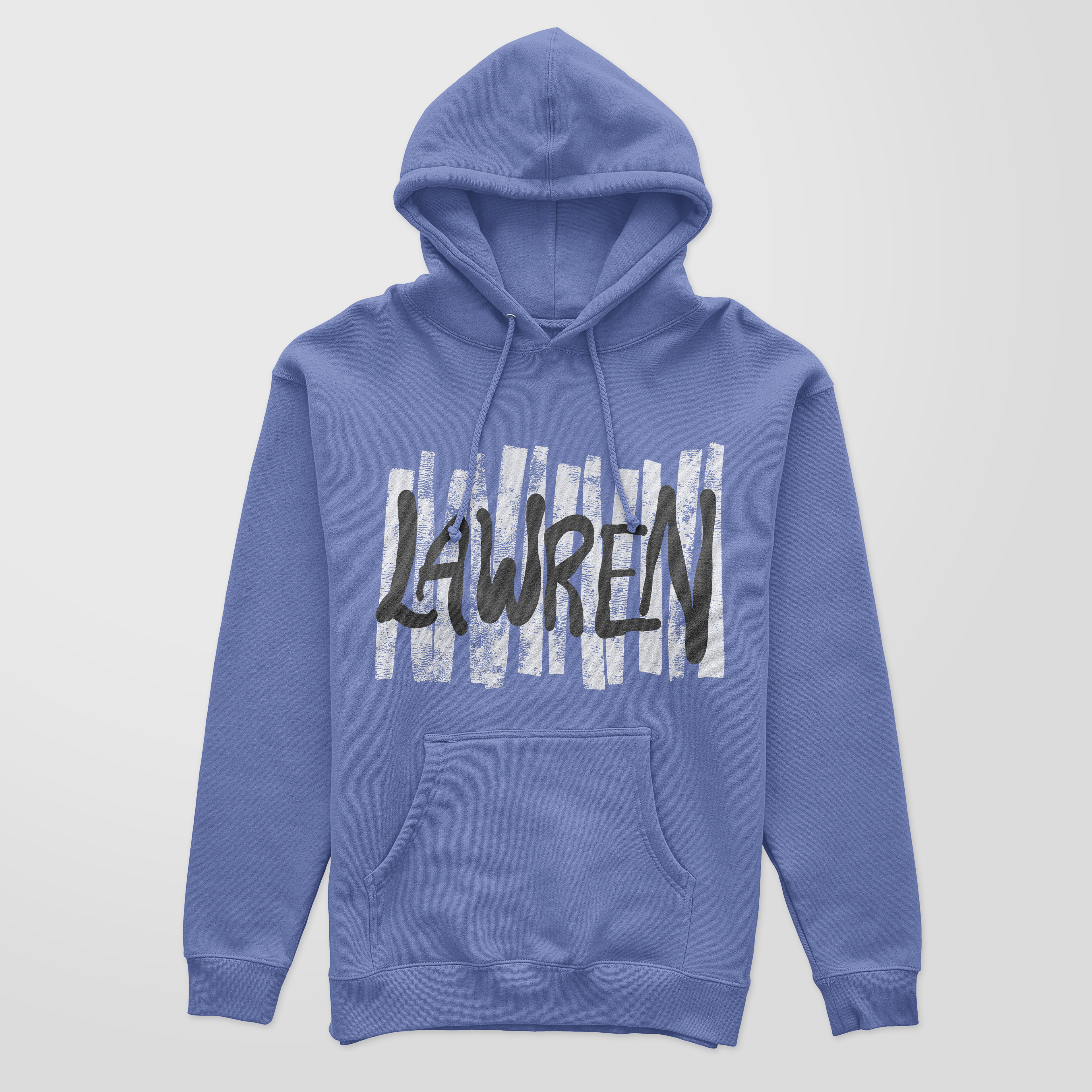
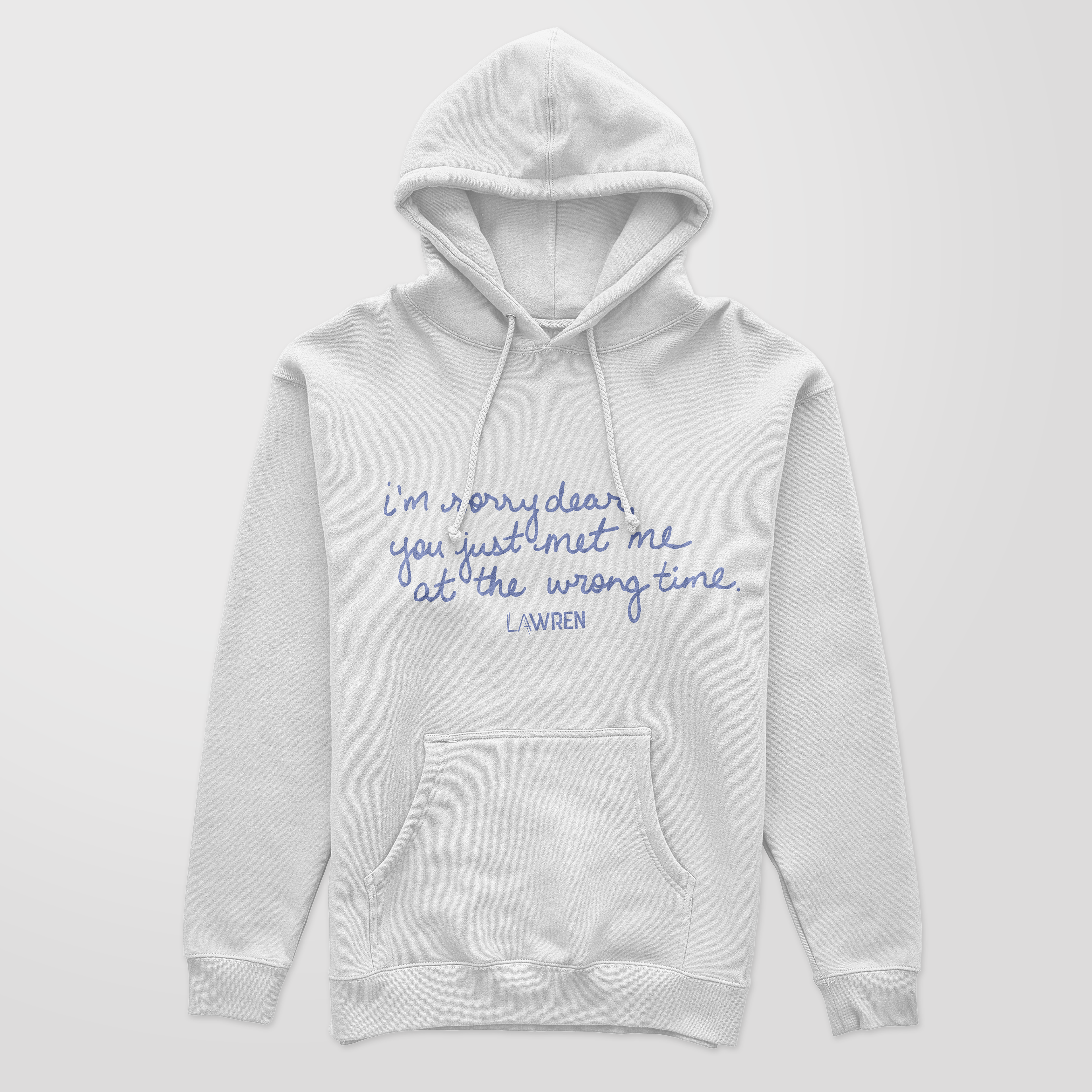
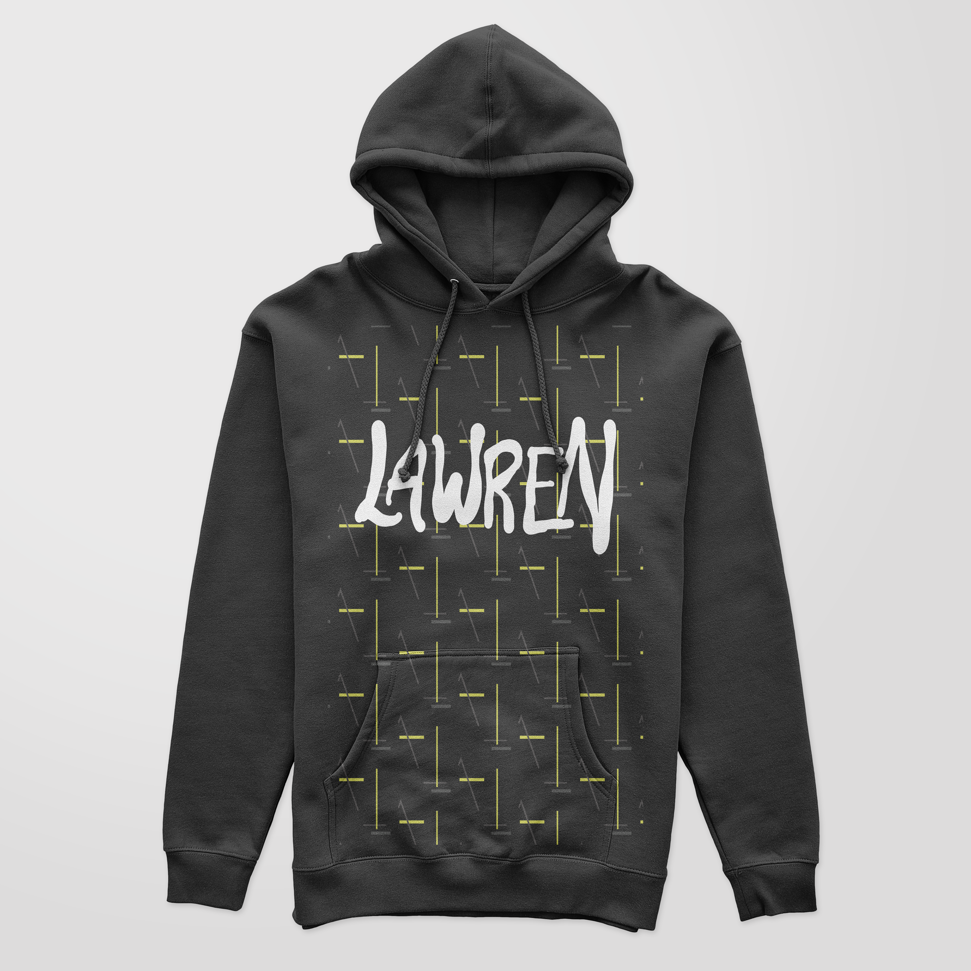
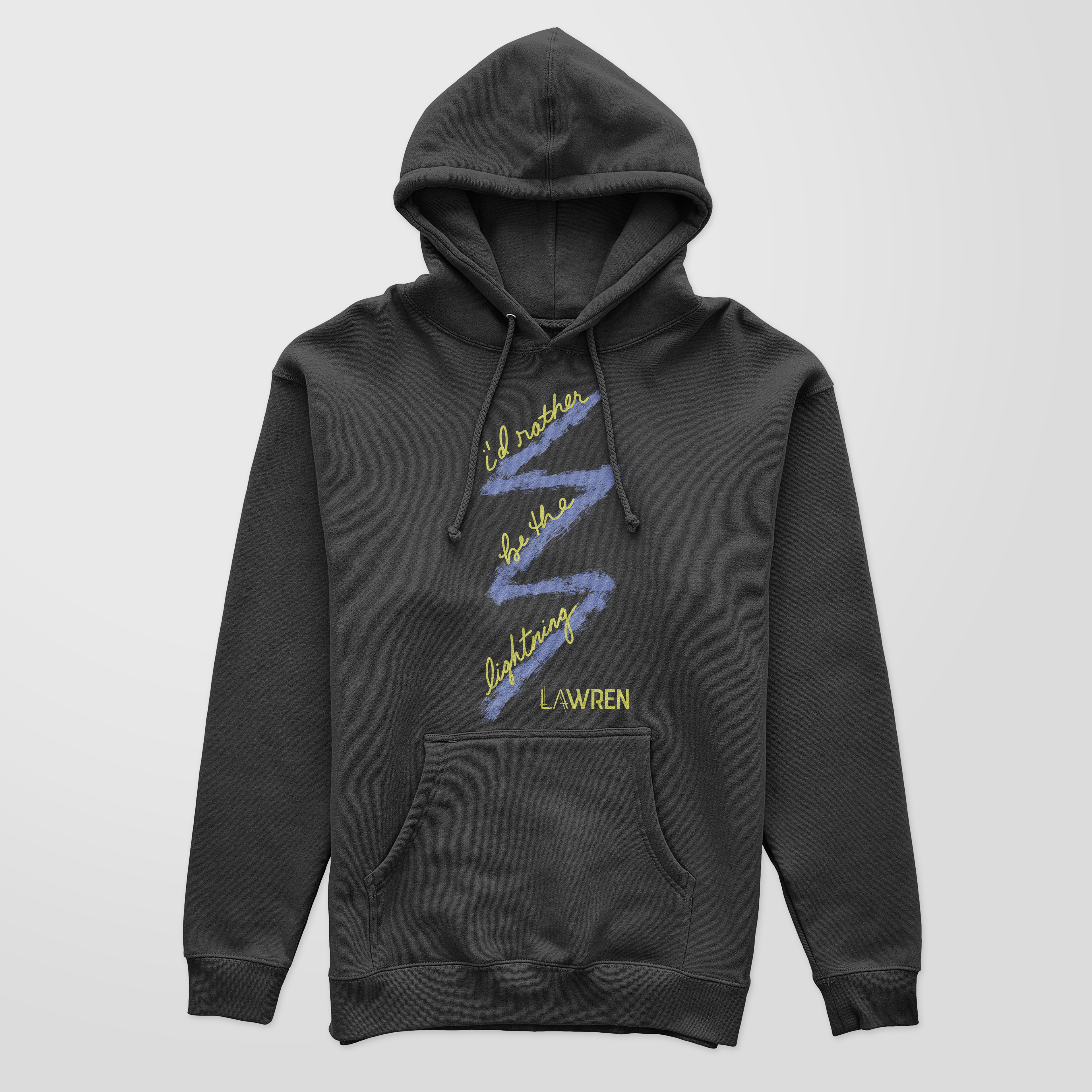
Merch Apparel Design
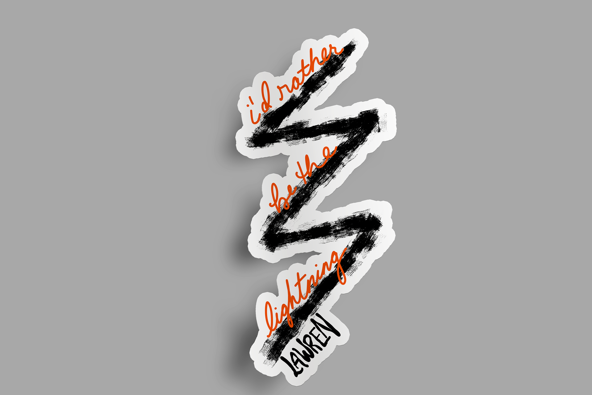
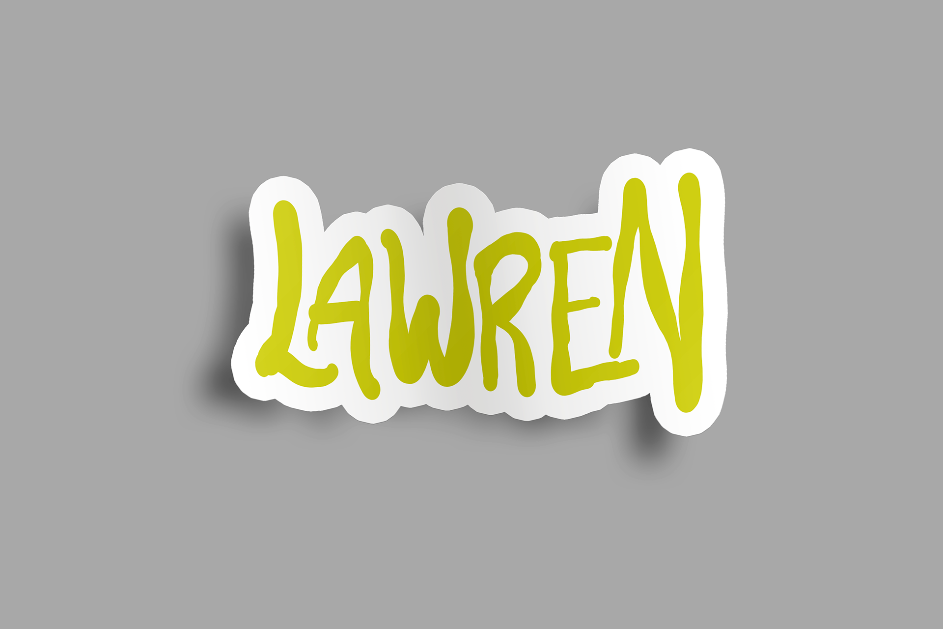
Stickers