
Case Study
Briar Rose Cookie Co.
BRAND STRATEGY & VISUAL IDENTITY DESIGN
Client Profile
Briar Rose Cookie Co. is a boutique bakery located in Southern California, specializing in hand-crafted, high-quality cookies. Their primary target audience is busy “rock star moms” looking for time-saving solutions while creating memorable experiences for their families and friends.
Briar Rose Cookie Co. is a boutique bakery located in Southern California, specializing in hand-crafted, high-quality cookies. Their primary target audience is busy “rock star moms” looking for time-saving solutions while creating memorable experiences for their families and friends.
Project Overview
The project started with a need to develp a new business name. Once Briar Rose Cookie Co. was established as the new business name, the primary challenge was to create a brand strategy and visual identity that would resonate with these incredible moms who need convenience without sacrificing quality or beauty. Briar Rose Cookie Co. needed a strategic brand overhaul to stand out in a competitive market and appeal to their ideal customer.
The project started with a need to develp a new business name. Once Briar Rose Cookie Co. was established as the new business name, the primary challenge was to create a brand strategy and visual identity that would resonate with these incredible moms who need convenience without sacrificing quality or beauty. Briar Rose Cookie Co. needed a strategic brand overhaul to stand out in a competitive market and appeal to their ideal customer.
Brand Strategy
Our approach focused on understanding the daily stresses moms face and offering them a brand that feels both approachable and luxurious. The brand strategy emphasizes the artistry behind the cookies, the use of premium ingredients, and the convenience of a time-saving solution for special events like birthdays and celebrations.
Our approach focused on understanding the daily stresses moms face and offering them a brand that feels both approachable and luxurious. The brand strategy emphasizes the artistry behind the cookies, the use of premium ingredients, and the convenience of a time-saving solution for special events like birthdays and celebrations.
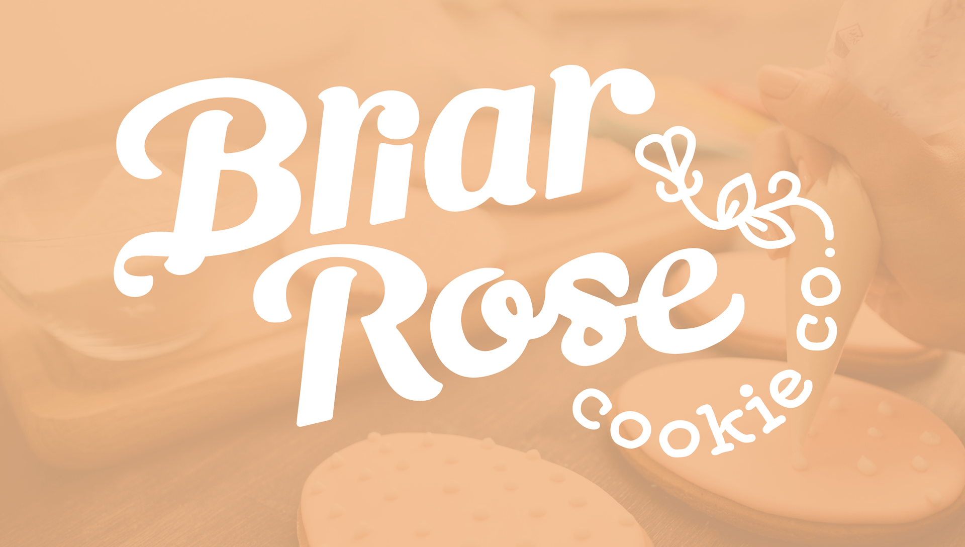
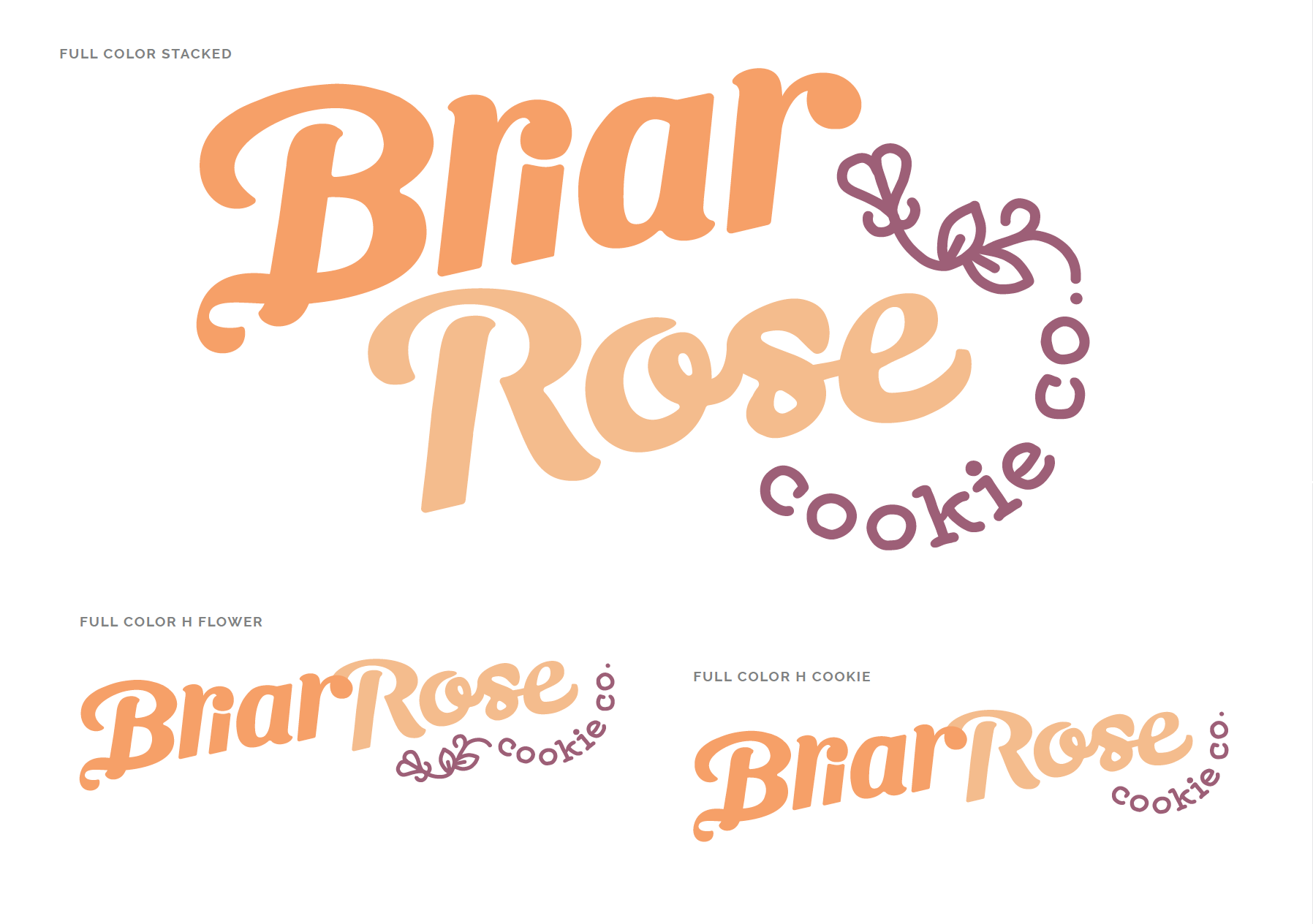
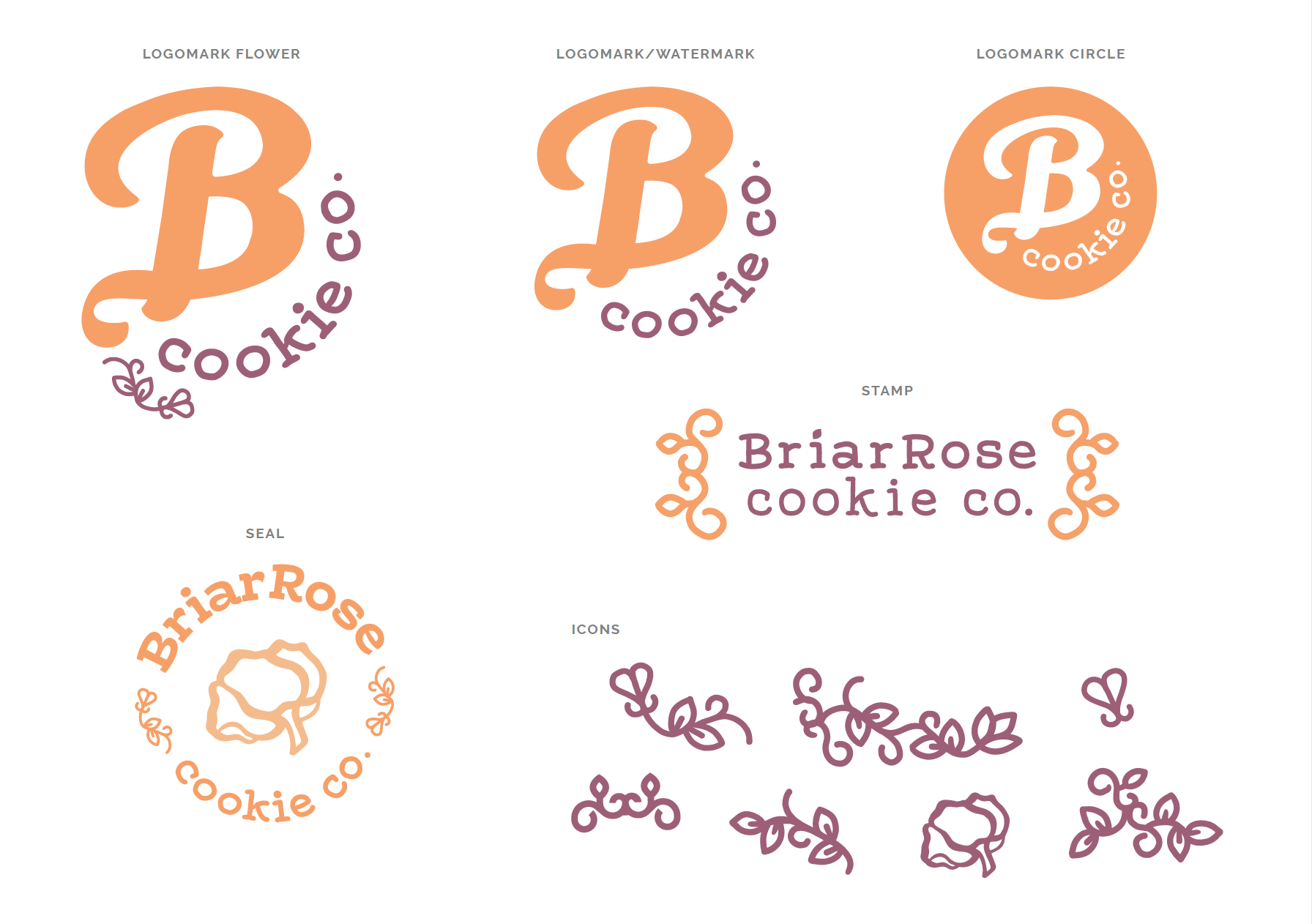
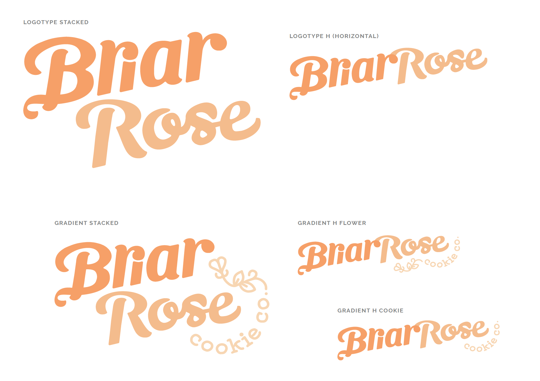
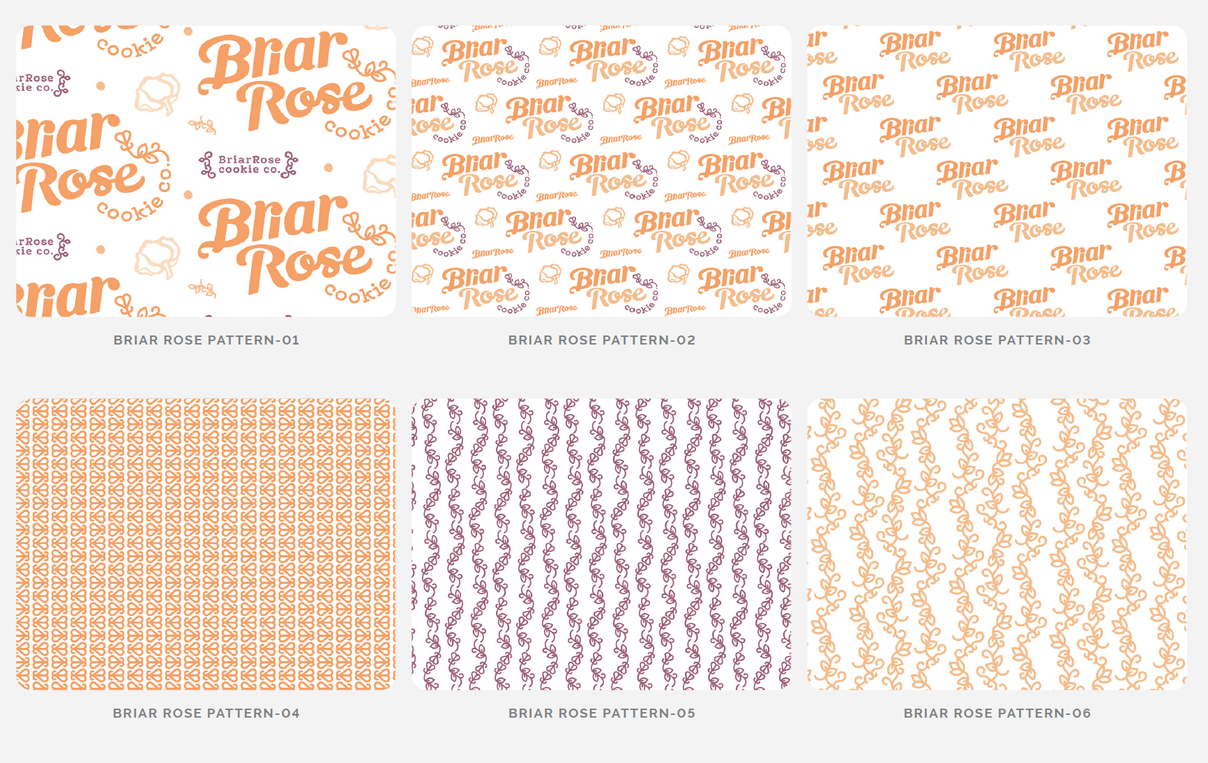
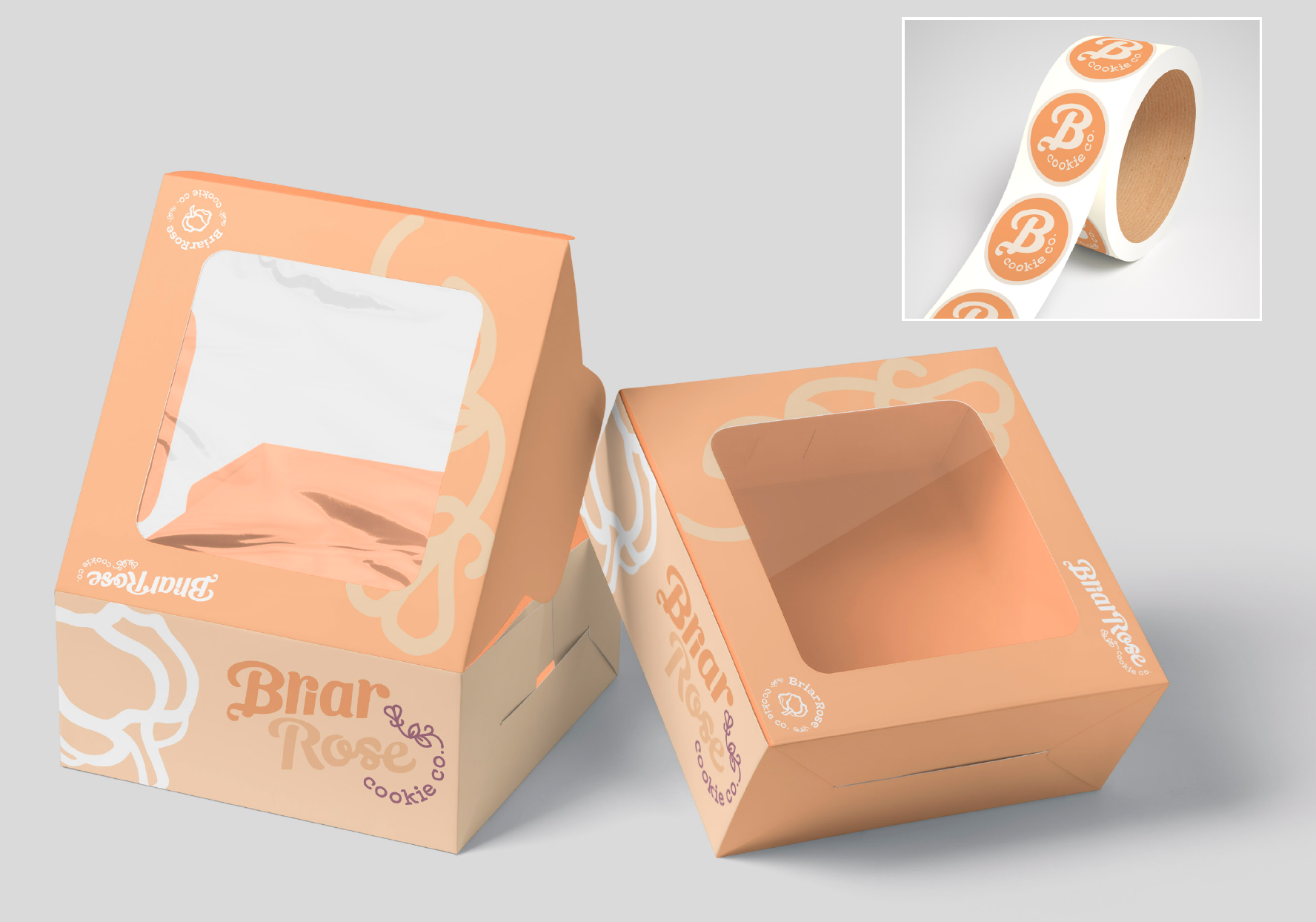
Visual Identity
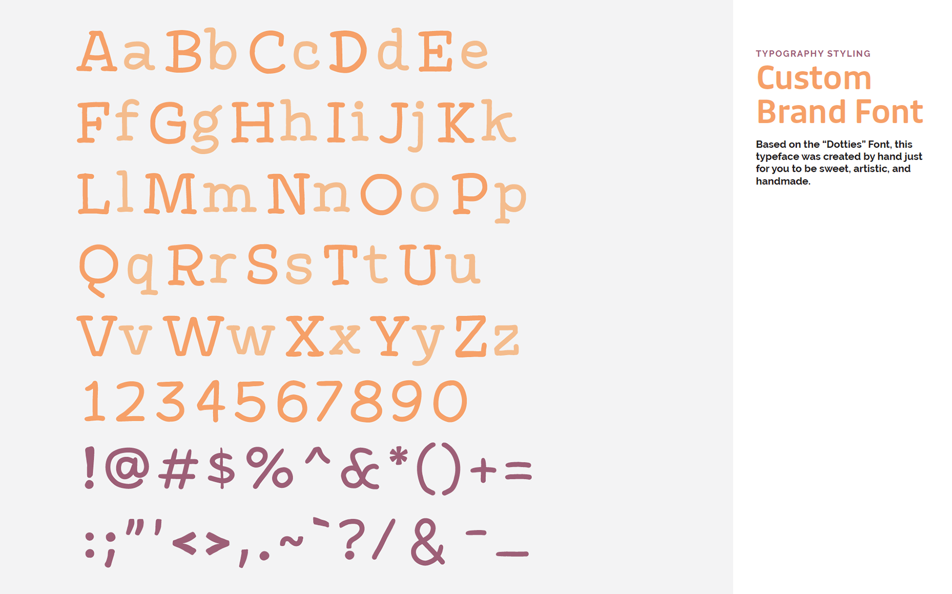
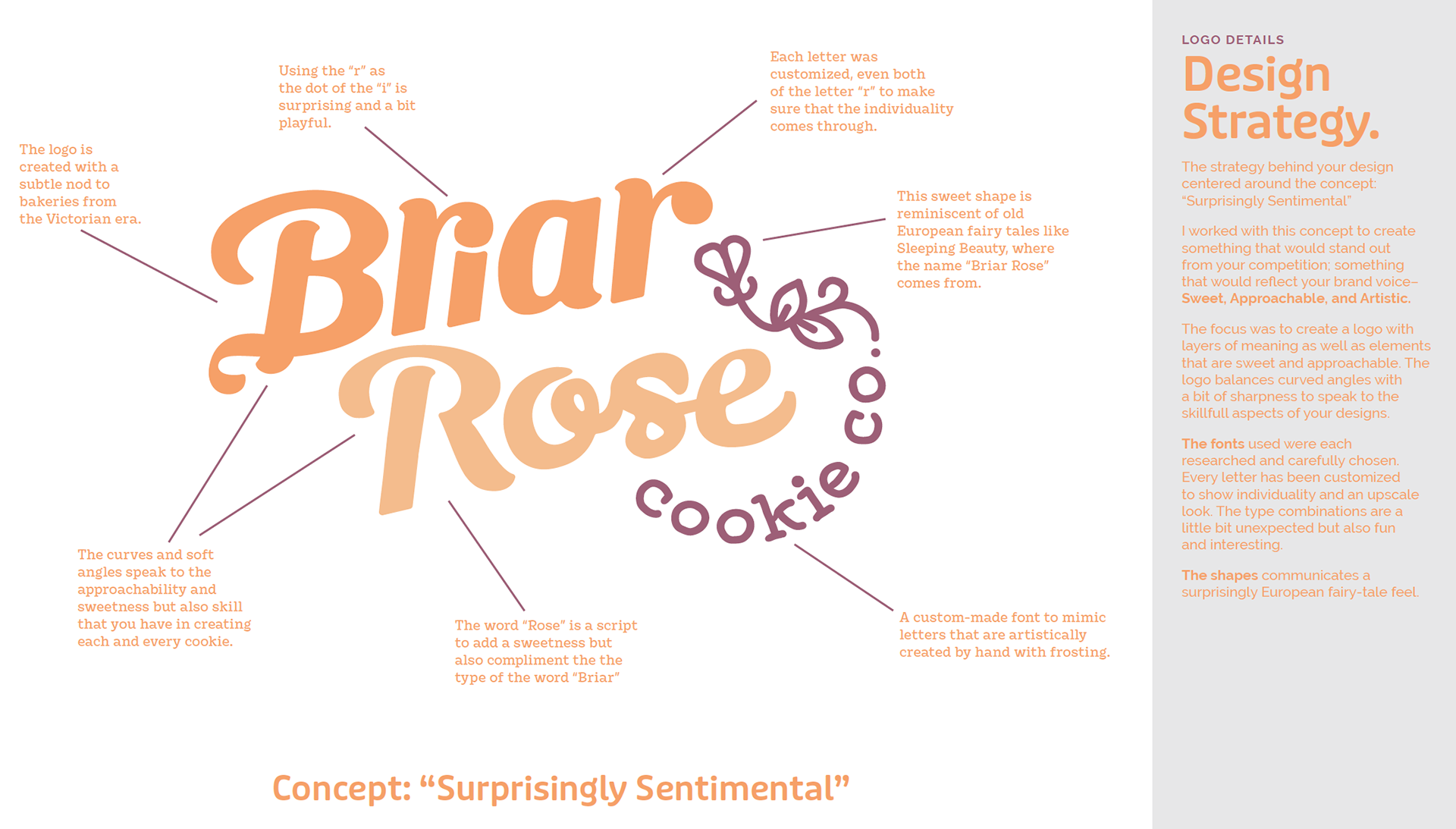
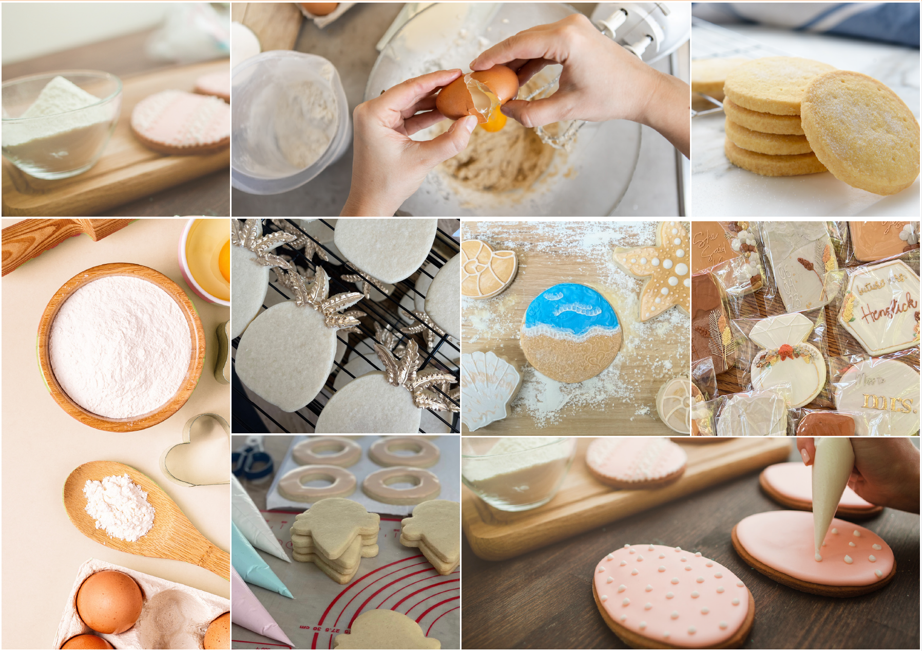
I developed a cohesive, visually appealing brand identity that speaks to the dream client. This included a captivating logo, a fresh and modern color palette, and typography that complements the sweet and approachable voice of the brand. The visual identity reflects both elegance and warmth, aligning with the lifestyle of busy moms who value high-quality products.
I developed a cohesive, visually appealing brand identity that speaks to the dream client. This included a captivating logo, a fresh and modern color palette, and typography that complements the sweet and approachable voice of the brand. The visual identity reflects both elegance and warmth, aligning with the lifestyle of busy moms who value high-quality products.
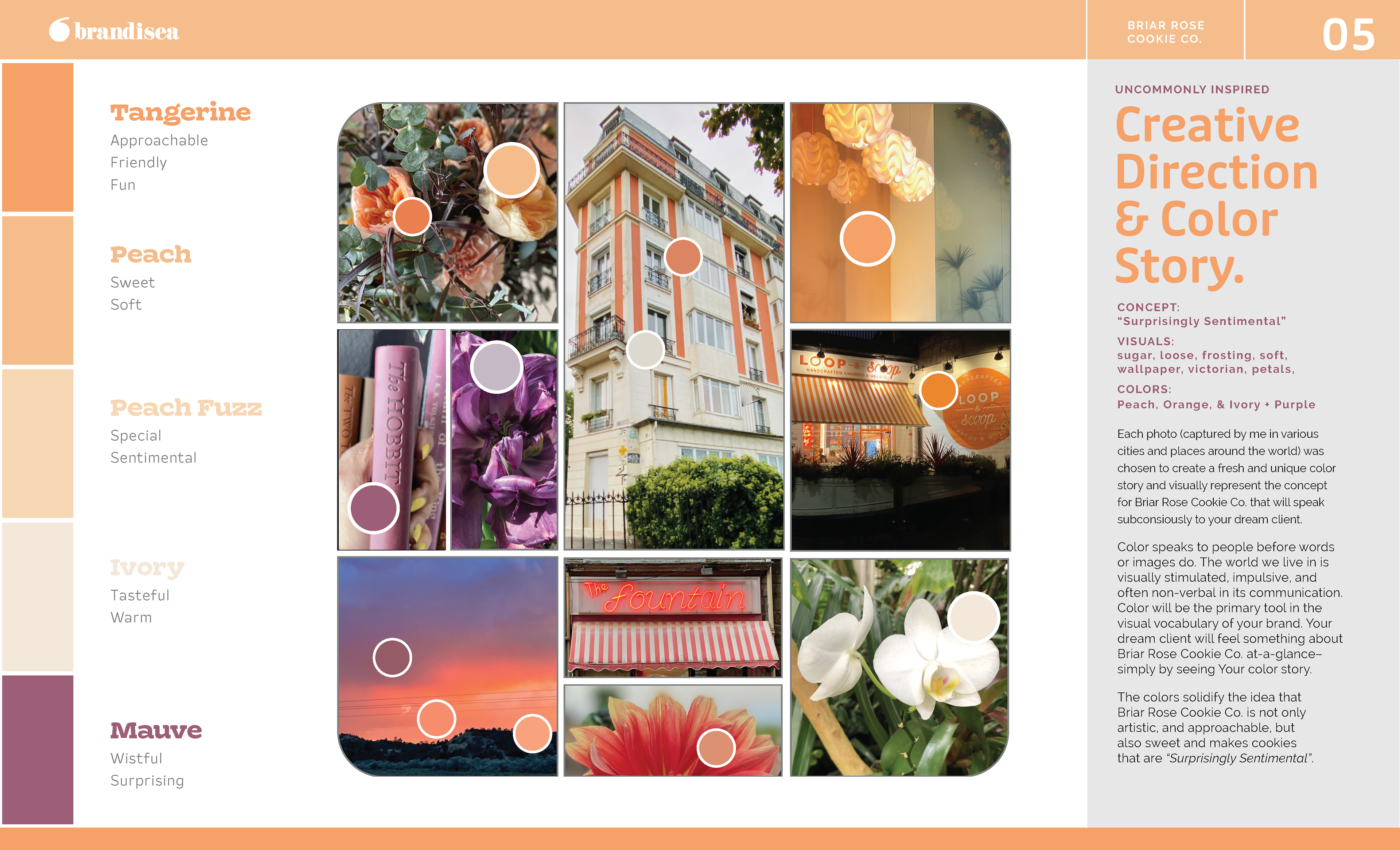
Concept: "Surprisingly Sentimental"
Visuals: sugar, loose, frosting, soft, wallpaper, victorian, petals
Colors: Peach, Orange, & Ivory + Purple
Messaging
To strengthen the brand’s emotional connection, we crafted a compelling brand story that highlights Briar Rose Cookie Co.’s value proposition. The messaging focuses on time-saving convenience while ensuring each cookie adds a memorable touch to special occasions. Through targeted messaging, Briar Rose Cookie Co. can clearly communicate its unique ability to deliver joy effortlessly.
Outcome
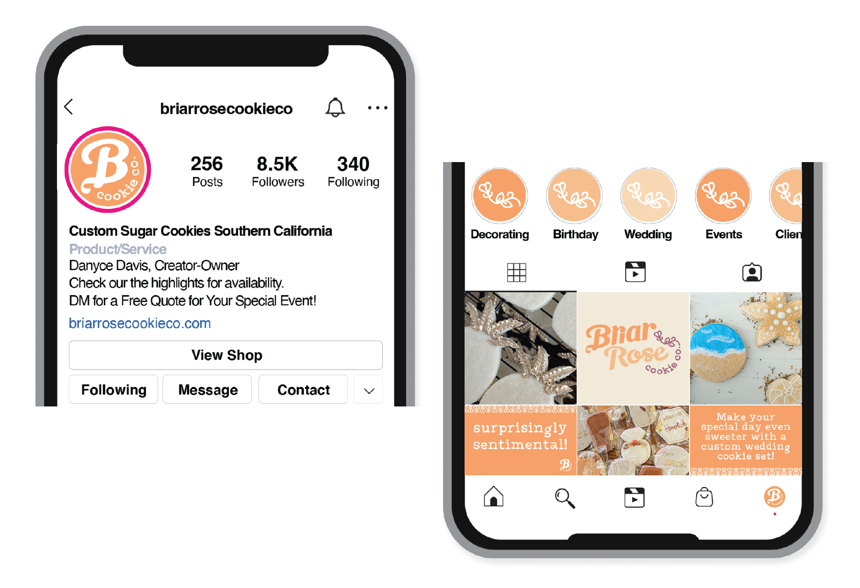
With the newly implemented branding, Briar Rose Cookie Co. is positioned as the go-to solution for “rock star moms” seeking delightful and memorable cookies for their family’s special moments. The brand now has a clear, consistent visual identity and a message that speaks directly to its audience, setting the stage for growth and success in the Southern California market.
With the newly implemented branding, Briar Rose Cookie Co. is positioned as the go-to solution for “rock star moms” seeking delightful and memorable cookies for their family’s special moments. The brand now has a clear, consistent visual identity and a message that speaks directly to its audience, setting the stage for growth and success in the Southern California market.